
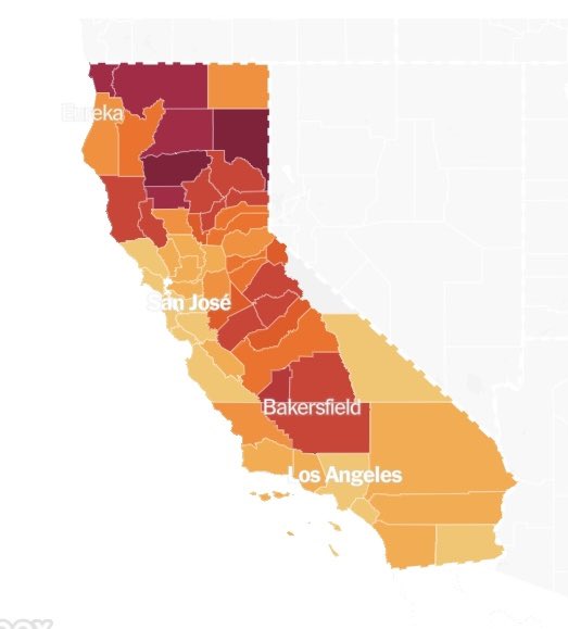
The map on the left is the recall results. The one on the right is the current COVID situation.


@DrEricBall Getting thru this pandemic was never going to be easy. But it would have been a LOT easier if it hadn’t become politicized.

@DrEricBall @KevinlyFather This isn’t the first time I’ve noticed this. I posted the similarities on the maps during the presidential election last year.

@DrEricBall I found out just now that a hard core Trumper anti vaxer neighbor died last night from Covid. His wife died two weeks ago from the virus. I noticed their son took the Trump flag down. This is all I’m going to say about that.

@DrEricBall @RonFilipkowski Lol you’ve confused the fuck out of everybody

@DrEricBall Sneetches with stars on their bellow. Such tribalism


@DrEricBall Just replace your last name with "Ding". Might suit you better.

@DrEricBall I'm guessing it's a per-capita COVID map, which would result into nothing more than Common Core Math for pseudo-llectuals.