Why does everything feel like the world is falling apart, yet the stock market has looked like this since 2009? Well, here's a thread w/ some interesting charts that will help you understand: what you see is NOT what you get. 1/

1K
6K
16K
0
5K
Download Image
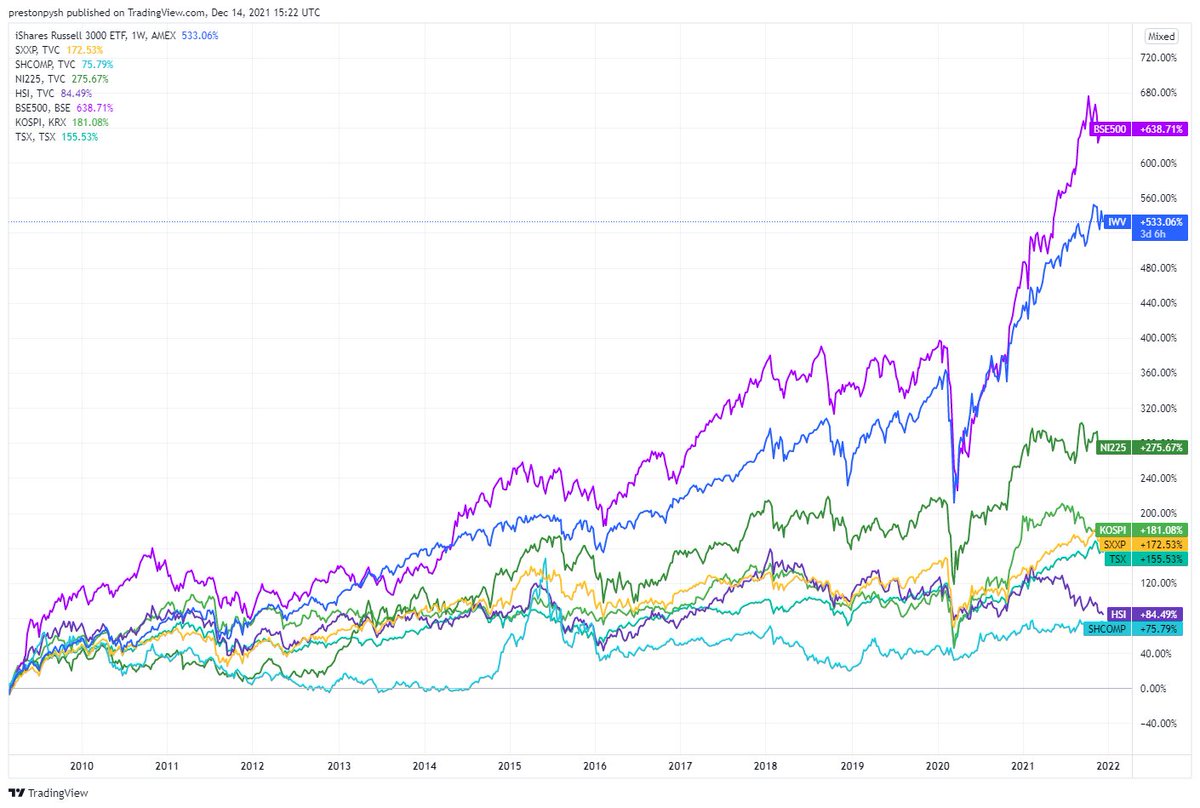
Let's start by looking at how the major stock indexes around the world have recovered since 2009. Shown below, in the order they appear on the chart: India 638% USA 533% Japan 275% Korea 181% Europe 172% Canada 155% Hong Kong 84% China 75% But...