
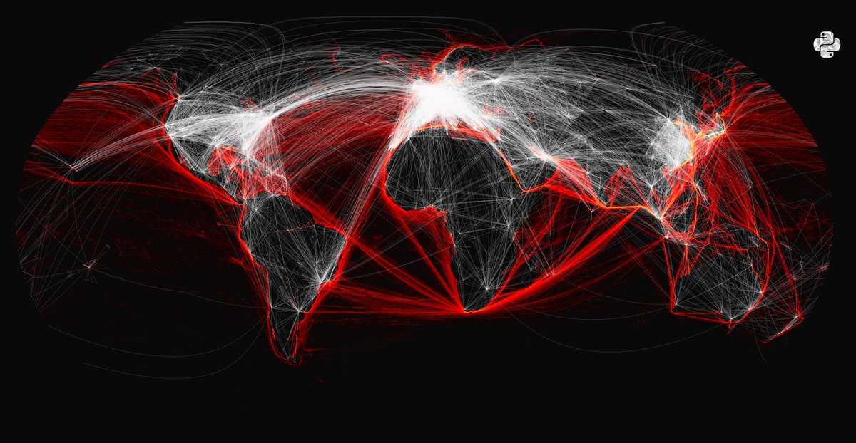
I have combined two datasets for fun. Here are the world's shipping lanes (red) and the worlds flight paths (white) on the same map.

@PythonMaps Over what time frame was the data set? 1 year? What data was used for the flight paths?

@PythonMaps Are the white ones just overlapping over the red ones? Probably is a stupid idea, but what about using 2 colors and where they overlap the pixel color is the combination of the 2? Some shipping lanes are covered by planes

@PythonMaps Brilliant work. Would love to see Satellite SAR image density overlay on top of this

@PythonMaps They told us that Europeans ride on trains to protect the global climate. I don't understand.


@PythonMaps What projection did you use? It's interesting to see almost straight lines for the routes heading westerly from the cape of good hope. Majority of the others are curved (I assume as geodesics)

@PythonMaps Please overlay routes whales travel & whale strikes.


@PythonMaps Comfortably nestled for optimized trade.

@PythonMaps Realy cool, seems Europe is central of airplane cargo


@PythonMaps Can you filter it down to passenger or cargo routes? The flights might be more of the former, while the ships mostly cargo. Will be interesting to see how much overlap exists


@PythonMaps So the bottom line is, even though ships avoid land, for some weird reason, airplanes avoid sea to a large extent.


@PythonMaps It would be interesting to see how it would like in an equidistant projection, just a bunch of straight lines and those who are not straight would tell a story.