Recent Craft @recentcraft
Global branding agency shaping brands for the world's most innovative companies. recentcraft.com dubai Joined May 2024-
Tweets40
-
Followers11
-
Following19
-
Likes68
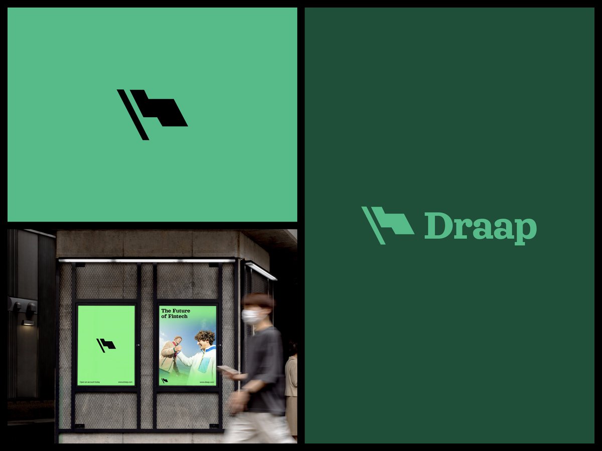
Meet Draap. We ditched the cold fintech blue for warmth, optimism, and a flag mark that means something. The future of fintech, launched. #Fintech #FintechDesign #BrandIdentity #LogoDesign #StartupBranding #GraphicDesign #VisualIdentity #Rebrand #BrandDesign #DesignInspiration
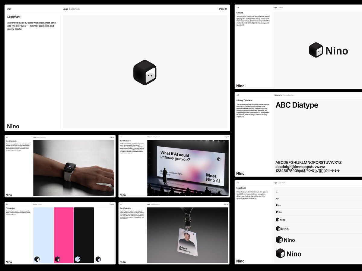
A rounded cube with two dot eyes. That's all it took to make an AI brand feel approachable instead of clinical. Nino's full brand guidelines, built end to end. #AIBranding #BrandIdentity #BrandGuidelines #LogoDesign #TechBranding #VisualIdentity #StartupBranding #DesignSystem
Sports brand identity built around a stylized eagle mark Designed by RecentCraft, bold, angular, and built to scale. #logodesign #sportsbranding #branding

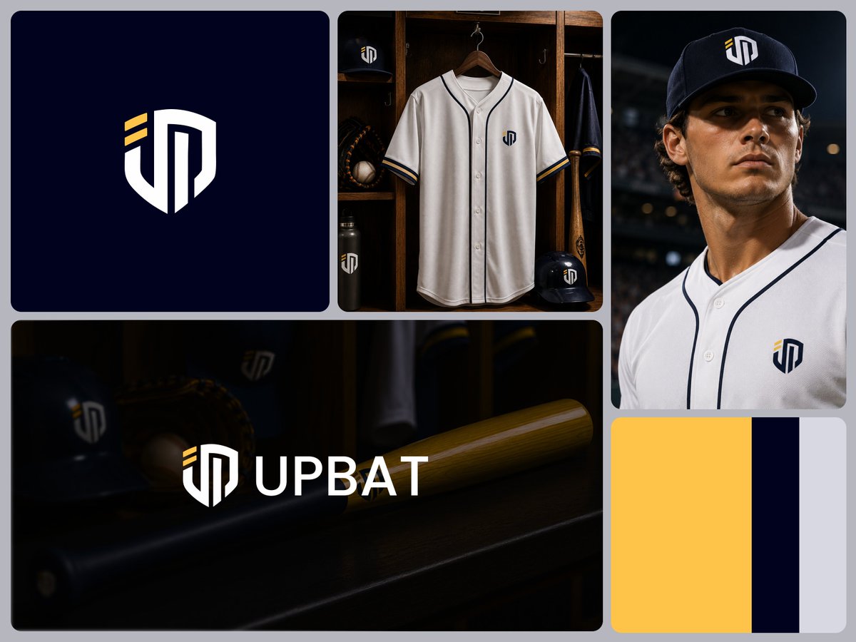
New brand identity for UPBAT — a baseball equipment and apparel brand. Shield monogram, navy/gold palette, tested on jerseys, caps, bats, and gear — not just a flat mockup.
New monogram identity for Maison Atelier — a luxury floral brand. The whole palette (burgundy, camel, linen) was pulled straight from the flowers themselves, not a generic "luxury" color story.

New shield monogram for UPBAT — designed at real jersey scale from the start. Navy, gold, and a mark built to actually survive embroidery, not just look good on a dark background.

Most fintech brands default to safe blue and corporate polish. For Mintly, we went the other way, deep black, lime green, and a playful clover mark that actually feels human.

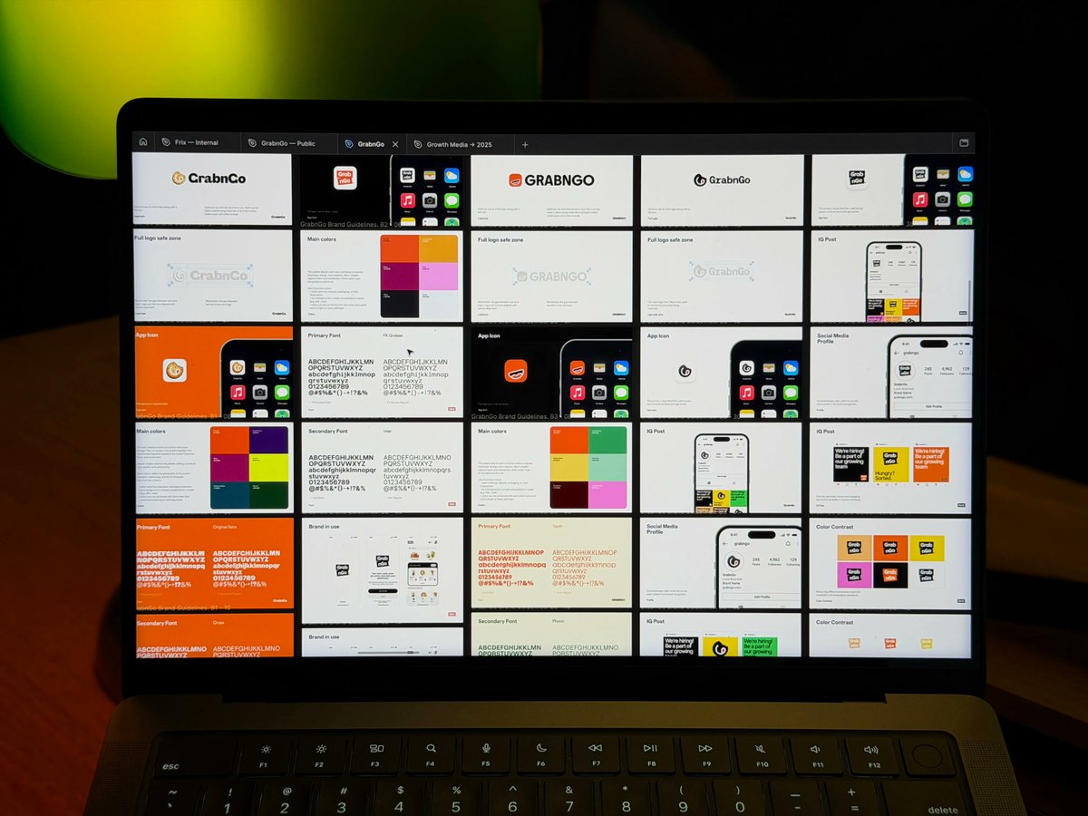
5 brand Identity Directions for Grab n Go
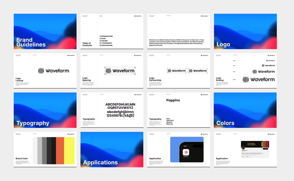
New brand identity for Waveform — a data analytics platform built for speed and clarity. Grayscale UI, warm signal-gradient accents, one locked logo lockup across every touchpoint.
6 logo directions, 1 tech client, 0 shortcuts. We always show real range — not small tweaks on one safe idea. The strongest mark shows itself in comparison. Open for new projects
New brand identity: Muno A product-driven brand needed a mark that felt considered, not loud. Here's how we got there
ntroducing Mavix — a bold, minimal identity built around a distinctive geometric mark. Simple. Modern. Memorable. #LogoDesign #BrandIdentity #Branding #Logomark

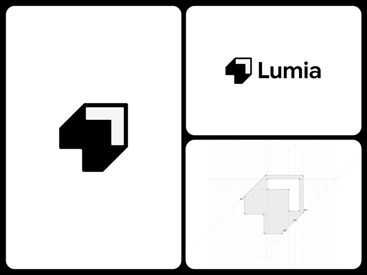
New logo for Lumia, a data consultancy Instead of the usual arrow-up cliche, we built growth directly into the mark, a stepped, ascending form at strict 45° angles. Precision + upward motion. #logodesign #branding
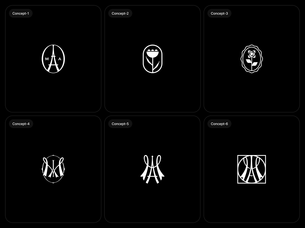
6 monogram concepts for "MA" — Parisian, elegant, exploring everything from a literal Eiffel Tower mark to abstract ribbon interlocks and botanical seals. Client work, more soon. #logodesign #branding #monogram
New logo mark for Orbit A four-point star cutting through an elliptical ring — compass meets trajectory, without being literal about it. Tested flat and on a full gradient system to make sure it holds up everywhere. #logodesign #branding

Concept-1, Concept-2, Concept-3... watch it build. Every mark answers the same brief a different way. That's what exploration actually looks like. Client work in progress. DM us.
New identity for Wolar. A triangle inside a hexagon — simple enough to sit next to your Camera and Clock app without fighting for attention. DM us if you're building a brand that needs to survive your home screen.

New identity for Cortex. A hand orbited by an ellipse — abstract enough to hold attention, literal enough to stay memorable. Works just as hard as an app icon as it does as a full lockup. DM us if you're building a brand that needs a mark like this.

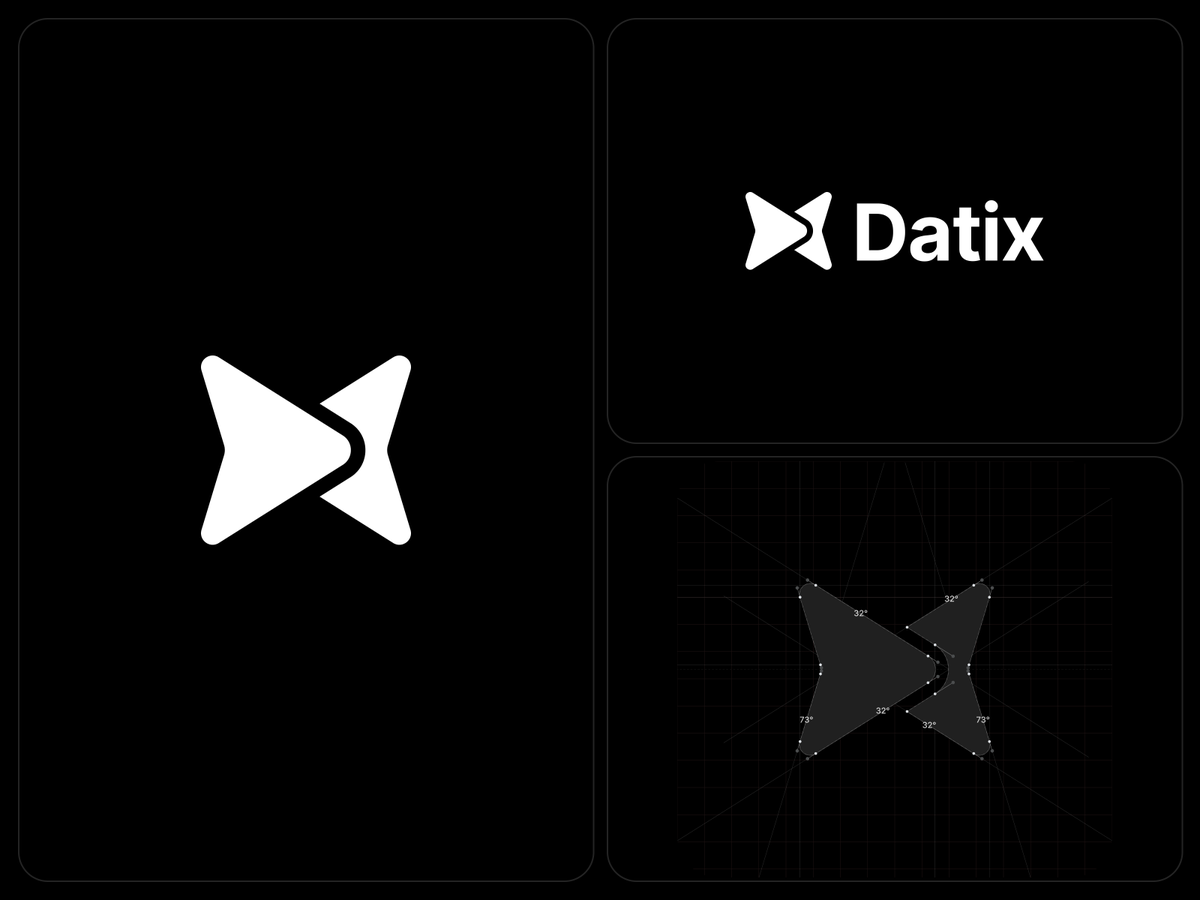
New identity for Datix. Every angle in this mark is exact 32°, 73°, nothing eyeballed. That precision is what makes two arrows read as one shape. DM us if you're building a data brand that needs this kind of rigor.
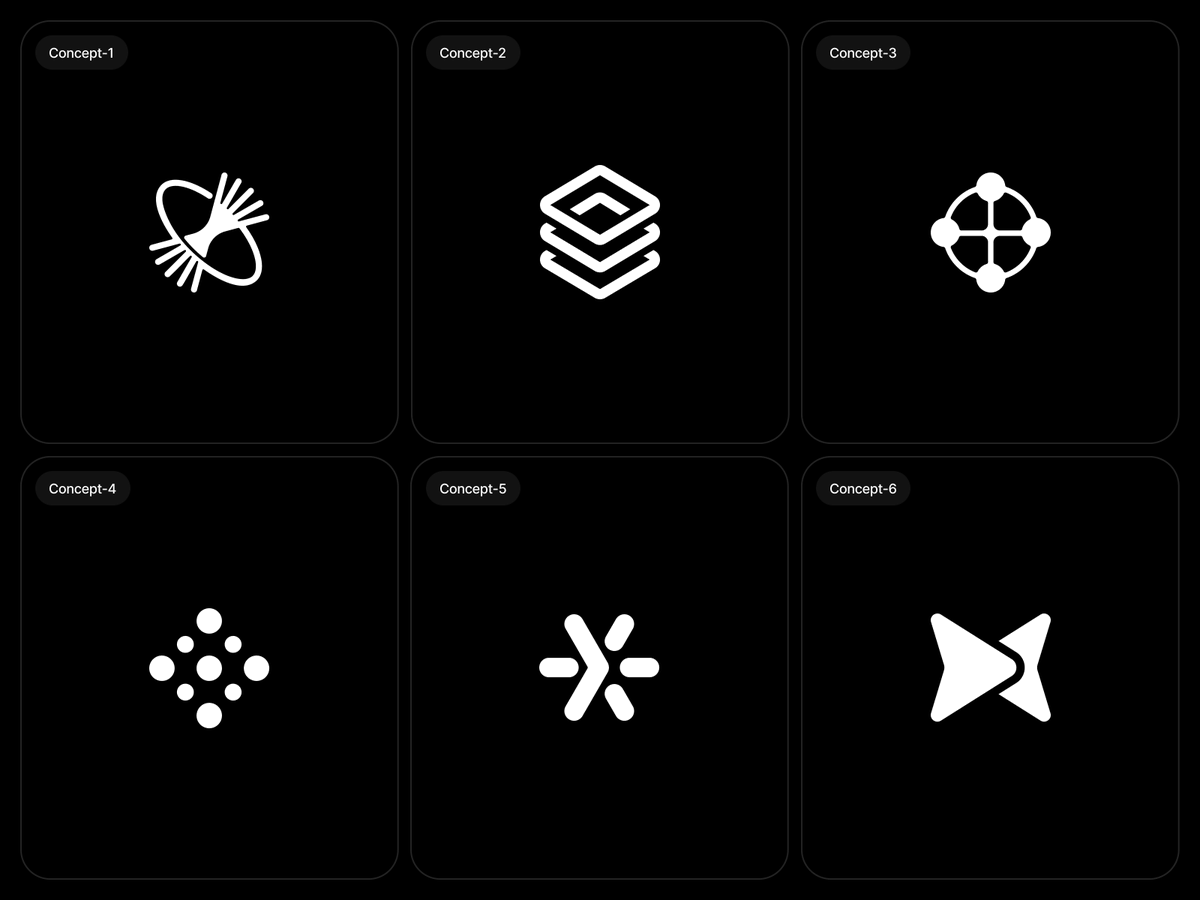
Six directions, one client brief. Each mark answers the same question differently: what does data management actually look like? Client exploration work. DM us.

Marketore @marketorecom
942 Followers 1K Following Marketplace that provide diverse design resources and digital assets.
Sujon Ali @Sujon_Alii
5 Followers 171 Following COO @OrixCreative — helping startups look as good as they perform. Design, branding, product.
Farhan Mia @farhanbranding
77 Followers 476 Following Brand Designer • @filllodesign Help startups look amazing and stand out. [email protected]

Bassam @bsamdesigner
117 Followers 818 Following مصمم شعارات وهويات بصرية | Strategic Brand Designer

Arta Labs @artalabs
63 Followers 186 Following Your environment shapes you. We run coworkathons for entrepreneurs, creatives, professionals or anyone wanting to work alongside others in productive spaces.
Pixel Perfect Desygn @PixelPerfact
2 Followers 111 Following Perfection Beyond Pixels • Web Design / Development Agency • Creating Web Experiences That Inspire & Convert • Project inquiry? Book a call👇
OrixCreative® @orixcreative
277 Followers 510 Following Your design partner for 0→1 SaaS & AI products | https://t.co/LqcxJeiyPL
gnaa ganaa @gnaa_ganaa46982
18 Followers 171 Following
Sajon @sajon_co
8K Followers 516 Following Founder https://t.co/YfefByTE4h Design partner for AI & SaaS founders Ex- @pwc @joinaviato @gamestarter 60+ startups designed, $150M+ raised
Motionimo @motionimo
11K Followers 1 Following Daily resources and inspirations for animation enthusiasts
Alex Aperios @AlexAperios
17K Followers 1K Following Branding + websites for founder-led companies | Clients include: @HelloGuillotine @blitzyai @RyloHQ @Birdiehouses + more · $100M+ raised. Open for projects ⤵
Wes @WesleyBancroft
16K Followers 4K Following Brand https://t.co/FoATJaOol6 → Dad of 9 kids + an amazing wife → Talking about brand, dad stuff

The Brand Identity @TweetsByTBI
42K Followers 0 Following Graphic Design’s Greatest, since 2015. Get featured → https://t.co/m4QyF7lG1M Decks, mockups, tools → https://t.co/bVgOzcZWVp
Nick @nickbakeddesign
51K Followers 3K Following Founder https://t.co/sMzgj3dqlc - Creative design agency for founder led companies | ex Meta, Netflix, Expa | custom components https://t.co/MHoqGBH2jq
Namya @ Supafast @namyakhann
55K Followers 790 Following Web design for B2B SaaS/AI companies https://t.co/b5rq670Qot | Clients include @youdotcom @11x_official @OpusClip @kintsugi_ai @SPRX_tax and 100+ others

Drapz @drapzdesigns
4K Followers 298 Following Brand Design & Systems for Startups Inquiries → [email protected]
Ankit @realankitp
802 Followers 27 Following product & brand designer, co-founder @ https://t.co/EaD9snxLzD
Alex Socoloff @socoloffalex
33K Followers 999 Following Former Google Principle Product Designer now Brand Artist https://t.co/NiwAbT1PvS ✷ Building @SilqueHQ ✷ Apparel Brand for Designers @cooldesignshit
Bakers Studio @studiobakers
6K Followers 344 Following We're the culinary masters of your digital kitchen! Want to cook something?👨🏻🍳 Reach us 💌 [email protected]
Rebrand @rebrandgallery
26K Followers 96 Following The curated reference library for brand designers Curated by @sahkyo_studio Submissions: https://t.co/akGvEfAx2j
Alexander Avdeev @privetavdey
4K Followers 1K Following I design products, websites and brands for startups

Albia @AlbiaHossain
7K Followers 824 Following I design & engineer products that converts.. for tech founders. From 0 → 1, idea to shipped product. Dm's open
Sha @its_sslvr
2K Followers 319 Following Accountant turned Web Designer \\\ Dev. Sharing UI explorations, design systems, and frameworks that I love. 7+ years in the trenches.
OrixCreative® @orixcreative
277 Followers 510 Following Your design partner for 0→1 SaaS & AI products | https://t.co/LqcxJeiyPL
Sajon @sajon_co
8K Followers 516 Following Founder https://t.co/YfefByTE4h Design partner for AI & SaaS founders Ex- @pwc @joinaviato @gamestarter 60+ startups designed, $150M+ raisedYou might like