Search results for #30DayChartChallenge

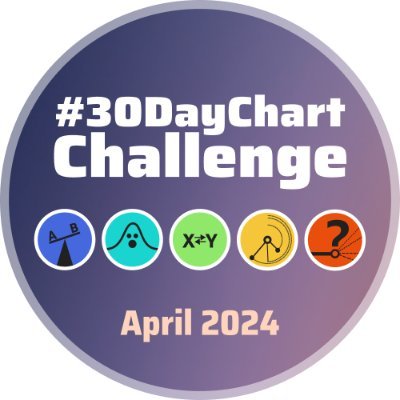
Hello #DataFam For #Day26 of #30DayChartChallenge the Prompt was #AI and I have explored "The rise of AI-based LLMs". Today is International #chartday and this is my contribution to celebrate the day. Sharing the #Tableau Link: public.tableau.com/views/30DayCha… @DataVizSociety

#30DayChartChallenge Día 22: mobility El gráfico está basado en el fantástico trabajo de @CedScherer (su código aquí:github.com/z3tt/TidyTuesd…) Traté de mostrar el número promedio de lesiones y accidentes de tránsito en Ecuador. Datos: ecuadorencifras.gob.ec/transporte/


Day 26 of the #30DayChartChallenge - AI: The first 25 minutes, and the last 23 minutes of 2001: A Space Odyssey contain no dialogue


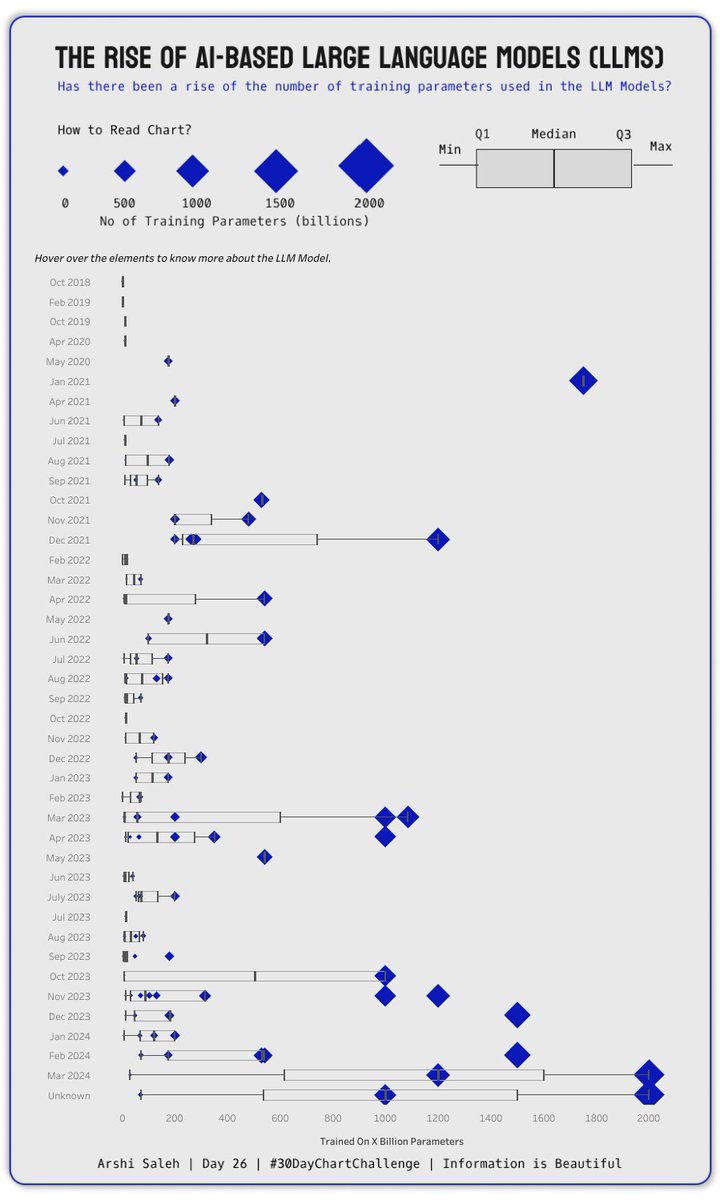
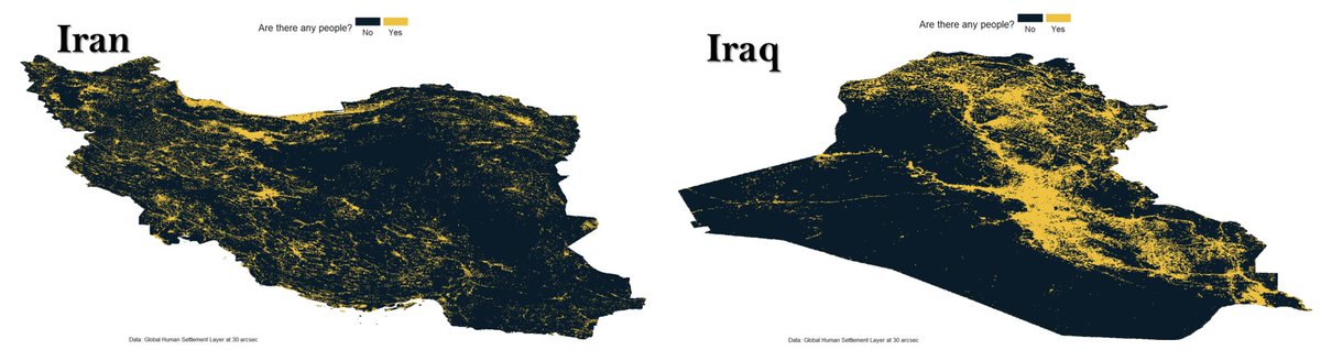
Weekend vibes + Middle East population maps = 🔥🔥🔥 Explore where people call home using #GHSL & #R! 🇹🇷 🇸🇦 🇮🇶 🇮🇷 🇸🇾 🇴🇲 🇾🇪 🇯🇴 🗣️Inspired by @milos_agathon #30DayChartChallenge #dataviz #geography #MiddleEastern #R #weekendfun


For #ChartDay here's a chart of charts I've made so far for #30DayChartChallenge 😅📊📉

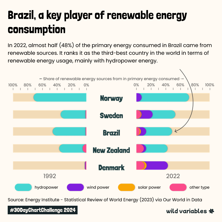
#30DayChartChallenge Día 21: green energy El gráfico muestra el consumo de energía renovable en 9 países de América del sur y está inspirado en el grandioso trabajo de @GilbertFontana. El reportaje de Naciones Unidas: un.org/es/climatechan… Datos: api.worldbank.org/v2/es/indicato…


Day 26 | #30DayChartChallenge | AI 📊: public.tableau.com/app/profile/br…


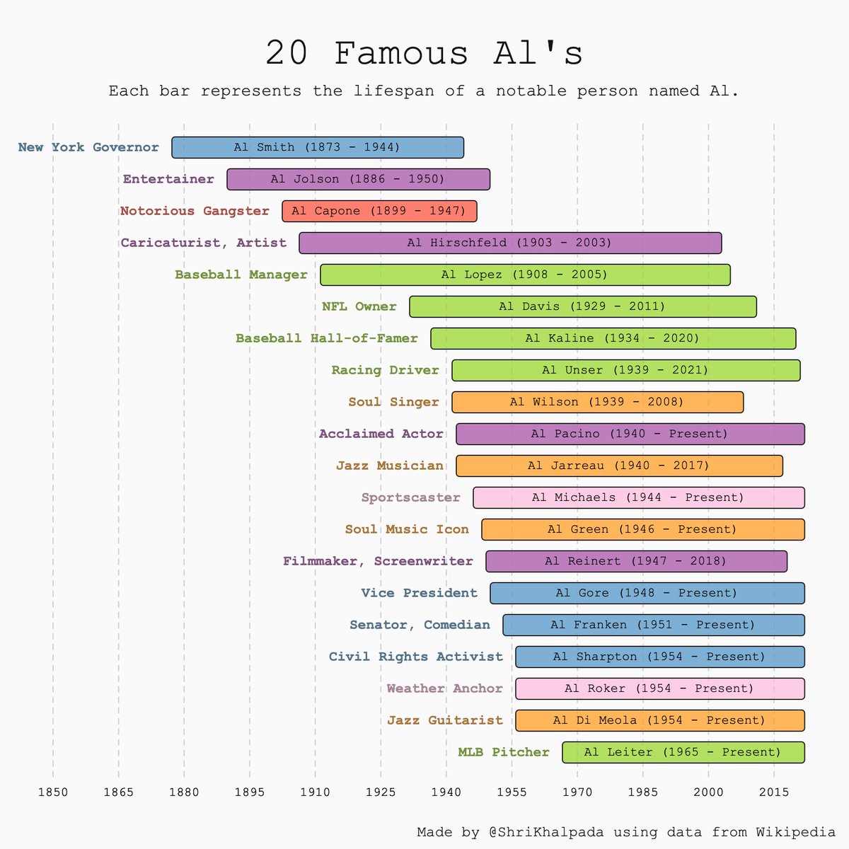
Today's #30DayChartChallenge theme is "AI". I've been feeling a bit AI'd out, so I decided to make a chart about Al's instead!

#30DayChartChallenge | Day 21 - Green energy Top 5 Countries in Renewable Energy Consumption (2022) Made with RawGraphs and Figma

#30DayChartChallenge Day 26 AI Percentage of people aged 16 to 64 with Level 3 or above qualifications, 2019 - 2021 Data Source: @ONS …lore-local-statistics.beta.ons.gov.uk/indicators/lev… Created in: @ChatGPTapp


Kudos to Sherzodbek Ibragimov for the crisp and creative US Wind Energy Impact Metrics visualization. The hexagonal design makes state-by-state data comparison intuitive and engaging! #RenewableEnergy #DataViz #30DayChartChallenge public.tableau.com/app/profile/sh…

2024 #30DayChartChallenge | day 26 | uncertainties | ai . This #viz compares LLMs with different parameter numbers from 2018-2024, highlighting those with over 750 billion parameters. Data source: Wikipedia. . 📂: github.com/poncest/30DayC… . #rstats | #dataviz | #rstats | #ggplot2

Day 25 of the #30DayChartChallenge - Global Change: The globalisation of the Premier League.


For perhaps a more analytical approach, (but not to take away from the writing and analysis of @itsdanielcohen) here is another way to view strength of schedule. I simulated the upcoming @watchUFAtv season 1,000 times... More details below in 🧵 #30DayChartChallenge


For perhaps a more analytical approach, (but not to take away from the writing and analysis of @itsdanielcohen) here is another way to view strength of schedule. I simulated the upcoming @watchUFAtv season 1,000 times... More details below in 🧵 #30DayChartChallenge https://t.co/5TRT3bCMTT


Wrote a short article on Using base R to make the 2024 day 04 waffle themed for #30DayChartChallenge using cat images instead of waffle tiles @Medium #rstats #dataviz #data #dataScience Read this story from Simisani Ndaba on Medium: medium.com/learning-data/…

From Vienna to Berlin, we're uncovering Central #Europe's secrets with #esriLivingAtlas data & R! 🤫💻 Check out the diverse landscapes of Central Europe's capital cities🇦🇹, 🇨🇿, 🇫🇷, 🇩🇪, 🇭🇺, 🇵🇱, 🇸🇰, 🇸🇮, 🇨🇭😎 #30DayChartChallenge #UrbanPlanning #RStats #esri


Very busy with work projects this week and no energy for #30DayChartChallenge tonight. Will catch up over the weekend.


#30DayChartChallenge | #Day21 | #GreenEnergy Revisualize the energy consumption by source chart @OurWorldInData , diverging green and non-renewable energy. While Indonesia is struggling, Norway is comfortable using green energy. #Tableau #DataFam public.tableau.com/views/EnergyCo…


#30DayChartChallenge Day 25: global change 🌏