Search results for #DataViz

Hey, check out my latest #dataviz, 🅦🅗🅞🅓🅤🅝🅝🅘🅣? Today, you are the detective🔎 Use this dashboard to choose a victim was and a crime setup, and unveil the murderer's profile: gender, age and motive! #AgathaChristie @DataVizSociety #ChartDay #Tableau public.tableau.com/app/profile/ir…

Learn how to draw a dual-axis chart like a pro with VChart! Add a right axis and bind corresponding series to achieve this. Check out the demo: ift.tt/9ZWgul8 #VChart #DataViz #DualAxis #DataVisualization ift.tt/xNKi8Vw


The DataVizFairy's visualization on Norway's shift to sustainable transport is as enlightening as it is visually serene. A great snapshot of positive change over the years! #Sustainability #DataViz #NorwayTransport 🍃🚗📈 public.tableau.com/views/NorwayAu…
Kudos to Sherzodbek Ibragimov for the crisp and creative US Wind Energy Impact Metrics visualization. The hexagonal design makes state-by-state data comparison intuitive and engaging! #RenewableEnergy #DataViz #30DayChartChallenge public.tableau.com/app/profile/sh…

Impressed by this Hospital A&E Patient Dashboard! Clear, concise, and rich with insights from gendered time analysis to wait times. Stellar work in making data accessible! #DataViz #HealthcareAnalytics shorturl.at/ewyS3


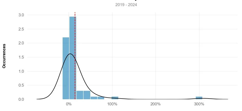
2024 #30DayChartChallenge | day 26 | uncertainties | ai . This #viz compares LLMs with different parameter numbers from 2018-2024, highlighting those with over 750 billion parameters. Data source: Wikipedia. . 📂: github.com/poncest/30DayC… . #rstats | #dataviz | #rstats | #ggplot2


To understand intent ("good faith"): Track the evolution of the provenances for valuable artworks that have been the object of restitution claims. What patterns emerge? When did provenances go "bad"? Ask: How? Who? When? Why? Klimt, Schiele, Picasso, Pissarro, Van Gogh #dataviz
To understand intent ("good faith"): Track the evolution of the provenances for valuable artworks that have been the object of restitution claims. What patterns emerge? When did provenances go "bad"? Ask: How? Who? When? Why? Klimt, Schiele, Picasso, Pissarro, Van Gogh #dataviz

"Discover how to fix abnormal Y-axis display in vchart's area chart with the solution provided by Darkside. Ensure accurate data visualization and improve user experience. #DataViz #vchart #Charting #TechTips" ift.tt/C9o4gKc

Wrote a short article on Using base R to make the 2024 day 04 waffle themed for #30DayChartChallenge using cat images instead of waffle tiles @Medium #rstats #dataviz #data #dataScience Read this story from Simisani Ndaba on Medium: medium.com/learning-data/…

Learn how to format axis labels in @visactor/vchart for improved readability and accuracy. Thanks to TingLittleKang for sharing this helpful solution! #DataVisualization #DataViz #CodeTips ift.tt/Lqgnlpw
Looking to position your chart at the far left of the canvas in vchart? Darkside's post explains how to do just that with the trimPadding configuration. Check it out and improve your visualization! #DataViz #Visualization #VChartTutorial ift.tt/PBT2oHm

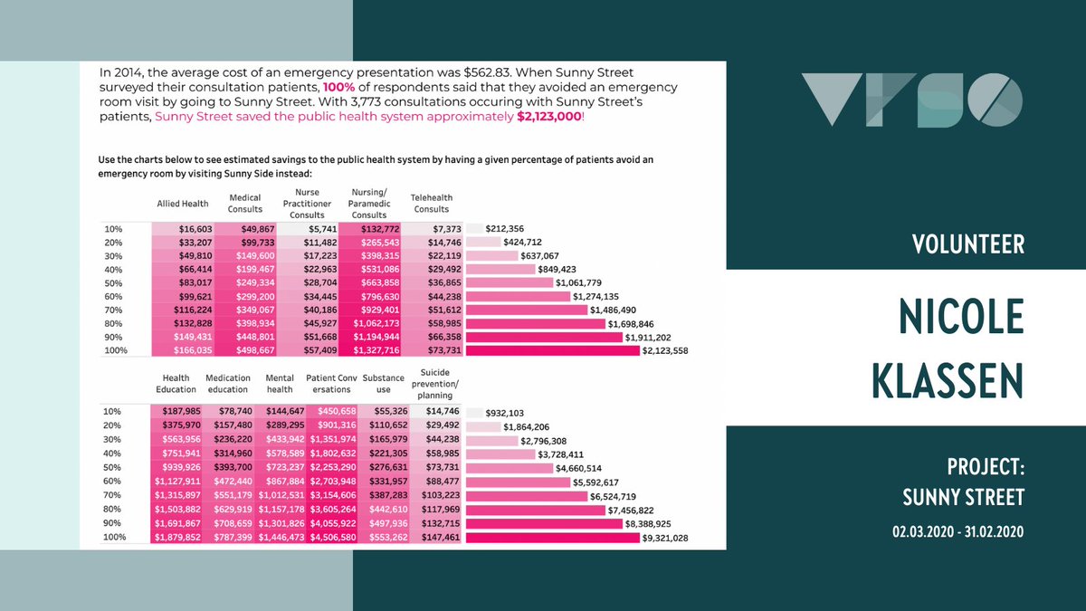
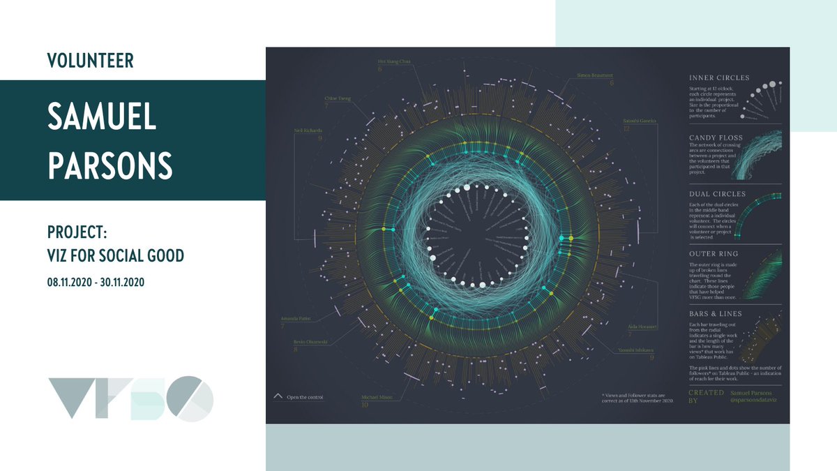
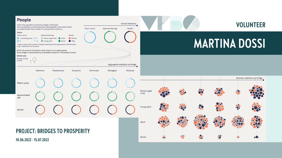
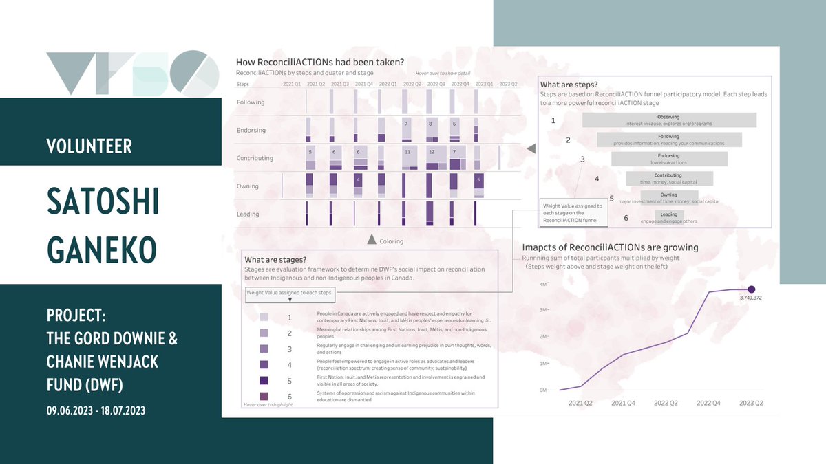
It's #InternationalChartDay 📊, and we're celebrating with some cool charts from #VizForSocialGood projects! #ChartDay #VFSG #DataViz #DataVisualization #DataFam

Cryto trading daily 🟥Open short #FTM/USDT Entry price:0.7565 👇👇👇 tinyurl.com/2ojylwfm #crypto #trading #python #DataAnalytics #DataScience #DataViz #IA


Ross @dataviz
340 Followers 462 Following Question everything know nothing. If your looking for the company their twitter is @datavizinc.
Dataviz Catalogue @dataviz_catalog
7K Followers 669 Following The Data Visualisation Catalogue: A library of information visualisation methods.
Data Science Central @Datasciencectrl
195K Followers 3 Following Part of the DSC Community and TechTarget, our focus is on data science, ML, AI, deep learning, dataviz, Hadoop, IoT and BI.
Market Cafe Mag - Dat.. @marketcafemag
3K Followers 550 Following ISSUE 8 OUT NOW | World's first printed mag about #dataviz - est. 2016 |🏅Gold winner @infobeautyaward | Founded by @Altiziana & @pierozagami
Chen Szu Yu @dataviz_szuyu
1K Followers 602 Following 臺灣人. graphics reporter @PostGraphics Previously @datagraphics @BBGVisual @BarabasiLab, @NU_CAMD. Tip me [email protected]
DataViz NYC @DataVizNYC
758 Followers 0 Following A meetup organized around data visualization, exploring concepts and technology; and the best data visualization networking in New York City.

Elevate Dataviz Learn.. @DatavizElevate
559 Followers 60 Following Elevate Your Dataviz Skills with techniques, freelance & career advice and live group-coaching with @AlliTorban, @duncangeere, @Data_Soul and @W_R_Chase
Dataviz Art/Skill @DatavizArtSkill
278 Followers 16 Following Data Visualization – the Art/Skill Cocktail by @ikashnitsky #datavizartskill
Data Viz Camp @dataviz_camp
622 Followers 53 Following A community-run open source conference focused on Data Visualization technologies on Sun Nov. 19, 2017 at Convene as part of @OpenCamps
Chimdi Nwosu @DatavizChimdi
5K Followers 2K Following Dataviz Doer | Tableau Visionary and Ambassador | 11 × #VOTD | 6 x #Vizzies | https://t.co/H59ouL3fFW | #MakeoverMonday | #TUGs | @DuboisChallenge @AnalyticsTUG
Let’s talk dataviz @DatavizCrit
450 Followers 81 Following Upcoming book from @lilachmanheim; Let's talk about dataviz: How to improve dashboards, reports, and other data presentations...one conversation at a time
Dataviz Adventure @DatavizAdventuR
820 Followers 827 Following 🇵🇪Enrique Mendoza | Data Visualization & Information Designer | Presentation designer | Infographic designer. I'm on my own adventure in the #dataviz world.
Wisevis, dataviz for .. @wisevis
5K Followers 2K Following Hi, I'm Jorge Camoes, #dataviz consultant & trainer (Excel, PowerBI, Tableau). My book: https://t.co/x5nJ2y2qUM. The other one: https://t.co/23Z4SqzTzz
Yoshitaka Arakawa (Yo.. @yoshi_dataviz
873 Followers 169 Following JP Account: @yoshi_datavizjp Blog: https://t.co/cZhbQla5Ax Tableau Public: https://t.co/6zy28FHF62 Linkedin: https://t.co/FxDjyVtlwa
Bristol DataViz Group @BristolDataViz
94 Followers 34 Following This is a group for individuals interested in data visualisation, where members can skill-share, discuss data visualisation topics and highlight great examples.
David Borczuk @datavizDB
2K Followers 1K Following Former Tableau Public Ambassador | Tableau Featured Author | #VOTD x 7 | Data Visualization Designer | Freelancer | All views are my own
Superb DataViz @prettydataviz
139 Followers 17 Following An account devoted to beautiful data visualizations. DM or @ for submissions. Run by @kmpanthagani. #dataviz
Toulouse-DataViz @Tls_dataviz
561 Followers 44 Following
Surreal_dataviz @SurrealDataviz
227 Followers 132 Following Life is complicated and the universe is run by chaos, let’s celebrate them with beautiful nonsense #dataviz! 🎉🥳📊
Dataviz & AI @DataVizAI
3K Followers 309 Following Tweets about Cool stuff related to #DataViz #PixelArt #AI #MachineLearning & #DataScience

Evelyn Münster @dataviz_de
516 Followers 612 Following Datenvisualisierung. Datenprodukte. Designing with Data. Newsletter: https://t.co/QdWRoPE9Cc

DatavizRio @DatavizRio
863 Followers 207 Following Projeto de divulgação e ensino em #dataviz pelas lentes do Design. Promovemos meetups, palestras, oficinas e cursos. Por @juliagiannella e @amorim_1979
Questions in Dataviz @questionsinDV
424 Followers 141 Following New book for 2022 from @theneilrichards - Questions in Dataviz, based on the https://t.co/sOlvzvZDlQ blog. Stay tuned for updates!
datavizBot @datavizBot
69 Followers 44 Following Daily posting of random, not always meaningful datavisualizations.
Açık Veri Gazetecil.. @DagmedyaVeri
4K Followers 62 Following @gijn üyesi Açık Veri Gazeteciliği PlatformuTR #verihaberciliği #verigörselleştirme #datajournalism #opendata #açıkveri #vg #ddj #dataviz hk.içerik üretir!📈
GPS DataViz @GPSDataViz
501 Followers 638 Following Our software gives coaches automated insights from their performance data that keep players healthy and help them WIN MORE GAMES! #EmpowerYourData
Stephanie Evergreen @evergreendata
16K Followers 256 Following Writing & teaching about #dataviz. Get immediately useful advice in my biweekly newsletter. she/her

DataViz, Inc. @DataVizInc
2K Followers 2K Following Developer of the iOS, Android, Mac & Windows productivity apps including DailyBalance, Docs To Go and Passwords Plus.
VOYD @voydorg
3K Followers 45 Following Veri Okuryazarlığı Derneği (VOYD) -Data Literacy Association(DLA) @voydorg_en #opendata #dataliteracy #ddj #datajournalism #dataviz https://t.co/gSTjR1GA7C
Dataviz Belgium @DatavizBE
345 Followers 122 Following Twitter account of the Belgian Dataviz Community 📊📈
CADA DataViz Wrkshp @cadadataviz
49 Followers 4 Following Data Visualization & Processing workshop @ CADA, April 20-22, 2009
FT Data @ftdata
52K Followers 52 Following Welcome to FT Data, where we share news graphics and data-driven stories from the @financialtimes. Run by the @FT Visual and Data Journalism team. #ddj #dataviz
PDX Dataviz @PDXdataviz
168 Followers 40 Following
Shirley Wu @sxywu
33K Followers 736 Following chinese-american artist, software engineer, dataviz designer, keynote speaker, published author && a work-in-progress learning to take up space ✨
Vancouver DataViz @VanDataViz
120 Followers 142 Following A group is for anyone interested in #dataviz #datavisualization #dashboards We love programmers, artists and data nerds! Located in beautiful #vancouver
Ketan Deshpande @ketan_dataviz
194 Followers 158 Following
World Bank Data @worldbankdata
79K Followers 412 Following The Development Data Group unlocks the full value of #data for development. Follow us for #opendata news, stories & #dataviz. More: https://t.co/SYIZiT3mF6
Ozancan Özdemir @OzancanOzdemir
7K Followers 1K Following PhD Candidate at @BernoulliInsti2 | İstatistik-@METU_ODTU | Ankara & Groningen | ML 🤖 | #rstats | Yerel Yön., AÜ| Galatasaray | #dataviz | Tweets in TR/ENG

Neil Kaye @neilrkaye
18K Followers 348 Following Climate data scientist @metoffice specialising in generating interactive websites and bespoke #dataviz. #climate #maps #GIS #mapping #Rstats Views are my own
USGS Data Science @USGS_DataSci
11K Followers 184 Following Featuring @USGS #dataScience and #DataViz
Antti Lipponen / @ant.. @anttilip
15K Followers 1K Following Physicist, research scientist at Finnish Meteorological Institute (@IlmaTiede). #Satellites, #aerosols, #climate, #remotesensing, #dataviz + #bike/#fatbike 🚲
zkn360 @zkn360_dataviz
458 Followers 124 Following #Tableau の中の人でした。Tableau/データ可視化の良い点、小技、アイデアを記録目的でツイートします。Tableau を普遍的なスキルにすることが目標。![a curated guide to the best tools and resources for data visualization and interactive storytelling. [curated by @carlvlewis, seeking others!]](https://pbs.twimg.com/profile_images/797970304513540096/bbHxXaEf.jpg)
DataViz.Tools @dataviztools
410 Followers 135 Following a curated guide to the best tools and resources for data visualization and interactive storytelling. [curated by @carlvlewis, seeking others!]
vr_dataviz @vr_dataviz
40 Followers 156 Following Let's discuss #VR and #data together! Every few weeks, we collect #info from different organisations & visualise. All things #immersive, #data & #visualisation.
Lisa Charlotte Muth @lisacmuth
35K Followers 729 Following Formerly @lisacrost. Creating & writing about dataviz for @datawrapper. #visber & @datavisclub organizer. Also over there: @[email protected]
Ryan Colliver @ryan_dataviz
289 Followers 492 Following Sr. Mgr., Prod Marketing & MICI @Lexmark. Husband & Daddy. Data Junkie. My views.
Lyon Dataviz @lyondataviz
292 Followers 282 Following La #dataviz sur Lyon. Prochains meetups sur https://t.co/yYu0ibTTzH par @romsson @aurelient @clemsos et @MAKIO135
DataViz Answers @DataVizAnswers
156 Followers 214 Following Tips and Tricks to make your data visualization successful. Ask good questions. Analyze all your data. Make your data beautiful!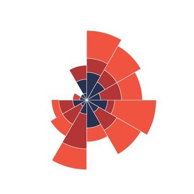

Fatma Çınar @fatma_cinar_ftm
2K Followers 534 Following Areas of Interest #DataManagement #Rstats #OR #GraphicalDatamining #DataViz #PractitionerProbabilist #ML #Finance #RiskManagement #Complexity #Chaos @DataLabTR
EDAV @ElectionDataviz
224 Followers 150 Following Elections Data Analytics & Visualization (EDAV) #Election2015 by @Orodata / Explaining election data using infographics and visualizations.
Dr. Dominic Royé @dr_xeo
15K Followers 2K Following -Understanding the World- Dr. in Physical Geography | Climate - Environmental Health. Researcher from 🇩🇪 at @FIClima 🦋https://t.co/FryUgBHKnJ #rstats #dataviz
Pacific Dataviz Chall.. @PacificDataviz
41 Followers 37 Following 🌏📊 Competition co-organised by the Pacific Community and the New Caledonian Government. Help us to breathe life into Pacific Data !
Ibrahim Tanyalcin @ibrhmTanyalcin
2K Followers 161 Following Software engineer,Geneticist, admin @MutaFrame,JS,Dataviz, https://t.co/3sUQEkSF6y… Views are my own. 62 69 74 63 6f 69 6e
dataviz.nl @dataviznl
58 Followers 67 Following Its timeline will be logged for usage in the dataviz lessons offered at CMD @ HvA. My feed is at http://t.co/VBwua5a0
LaurentMT @LaurentMT
9K Followers 623 Following dev@oxt_btc//bitcoin, privacy, data analysis&dataviz//PGP: 0x74D301663DF993B8D1C68B50A059A03E81CF61C9//"Idiot, outright dishonest and extremely incompetent"

Philipp Koytek @p4dataviz
85 Followers 172 Following ▪️◾️◼️⬛️ Data Visualization: Enthusiast | Designer | Engineer ⬛️◼️◾️▪️
Emil O W Kirkegaard @KirkegaardEmil
29K Followers 884 Following #psychology #genomics #hbd #rstats #statistics #transhumanism #dataviz #openscience #psychometrics @OpenPsychJour
Topicly DataViz @topiclydataviz
546 Followers 2K Following AI and ML bringing you the best data viz news.
Sharelock-Dataviz @SharelockDatavz
110 Followers 200 Following We are a design and data visualization research group of Density Design Lab at Politecnico di Milano
Sadettin Demirel @demirelsadettin
656 Followers 548 Following Dr. Öğretim Üyesi @uskudaruni | PhD @istanbuledutr | MS @goteborguni | BS @khasedutr | Co-founder @voydorg #rstats, #textmining #ddj #dataviz
Mustafa Çavuş @mustafa__cavus
2K Followers 897 Following Asst. Prof. of Applied Stat @esteknikuniv • Researcher @mi2_ai • PhD in Applied Statistics • Interested in #eXplainableAI #DataViz #rstats
Sam Lillo @splillo
14K Followers 889 Following Senior software engineer @DTNweather • Ph.D. @UofOklahoma • NWP across scales • Tropical Cyclones • S2S • Dataviz • Python • Tweets are my own
ZACH @ZachBowders
8K Followers 658 Following Data + Love Podcast | Tableau Visionary & Ambassador | Dataviz Maverick
DataViz.my @datavizmy
70 Followers 245 Following We are your data education. Our mission is to promote a culture of active learning around data. 🤝 Let's collaborate, DMs open to connect.

Dataviz Consultant @adhibaguspribdi
196 Followers 260 Following Konsultan, Trainer & Desainer Visualisasi Data| Hand's On Tableau Henry Harvin Analytics Academy | CP: 0857 0713 2649

DataViz @DataVizz
53 Followers 90 Following DataViz is a compilation of interesting data visualization and tools from the web.
Joshua Guo @JoshGuoDesign
12K Followers 380 Following Founder @ChartsSupply / Design System / 3D Artist

📈 DataViz.vg 🌱 @datavizvg
80 Followers 151 Following Dataviz for the Veg Community. Also sharing news about the plant-based movement.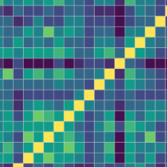
aRt of dataviz @aRtofdataviz
256 Followers 521 Following I do R #rstats #dataviz #dh #compsocsci workshops. Feel free to invite me to come teach you cool stuff! Also occasional dataviz & R tweets. By: @AndresKarjus
Jon Schwabish @jschwabish
24K Followers 993 Following 📈Economist & DataViz 🕸@urbaninstitute @PolicyViz 🎙PolicyViz Podcast 📺YouTube step-by-step tutorials 🗞On Substack: https://jschwabish.subst 👀All views mine
dataviz-factory @dataviz_factory
24 Followers 101 Following Créateur de dataviz, d'API, de bots pour data driven journalism. dev #d3js #javascript #node #bigdata http://t.co/4WtwHfkoTH
Econ_DataViz @Econ_DataViz
134 Followers 1K Following Visualising : Economics and Education focused, among other things.
Ramon Suarez 🇪🇺.. @ramonsuarez
7K Followers 239 Following Energetic, driven, imaginative and proactive problem solver into data analysis, business analytics, dataviz, value based marketing, pkm, learning and sharing.
Joshua Stevens @jscarto
15K Followers 1K Following Cartographic Editor @mapsdotcom & Content Strategy @Esri. Prev: DataViz Lead @NASAEarth, @NSF PhD Fellow @PSUGeography. Dad stuff everywhere else. Views my own.
The DataViz @The_DataViz
7 Followers 0 Following Medium Blog Focused on Data Visualizations, Analysis and Data Storytelling
OxShef @oxshef_dataviz
44 Followers 29 Following A collaboration between University of Oxford and University of Sheffield to promote a reproducible #dataviz workflow
Steven Bernard @sdbernard
14K Followers 429 Following @FT Senior Visual Journalist. Mad about cartography, dataviz and F1! Check out my QGIS youtube channel at https://t.co/6aTE6G8h0T Follow me on Instagram @stevendbernard
Infogram @infogram
16K Followers 5K Following 📊 Engage your audience with unique #dataviz, infographics, social media posts, and more.
Highcharts @Highcharts
6K Followers 165 Following World's most popular interactive #JavaScript chart library. Get support: https://t.co/XqC5DQxO2C #charts #dataviz
Mathieu Dataviz @mathieudataviz
80 Followers 139 Following Data Visualization Freelance, crafting #dataviz with creativity. Full stack, #dataengineer #datascientist. Exploring #data for fun and clients projects.
竜 SM₳UG @SmaugPool
11K Followers 1K Following Desinfluencer. Mostly blockchain software, dataviz, memes & gifs 🟣🔴https://t.co/AfZSwMmdjn 🌐https://t.co/Fp8ftE4mkQ 🌍SMAUG stakepool #Cardano #Bitcoin
dataviz_sp bot @dataviz_sp
200 Followers 783 Following Visualização de dados sobre covid do estado de São Paulo. #dataviz #covid Responsável: Raphael Silva, cientista de dados (https://t.co/MuoLWFv6mF…)
Qiusheng Wu @giswqs
38K Followers 5K Following Associate Professor @UTKGeography | @Amazon Visiting Academic | Senior Reseach Fellow @UNUINWEH | #EarthEngine GDE | Talk about #opensource #geospatial #dataviz
datavizOttawa @datavizOttawa
99 Followers 75 Following We're a group that meets regularly to discuss data visualization, data communication, infographics, exploratory data analysis,perceptual psychology, and more!
Laura @dataviz_student
51 Followers 448 Following Student of #graphicdesign // love #dataviz and #infographics
Natasha @dataviz_Tasha
74 Followers 109 Following